
So, I had some time on my hands today and I made some more logos for The Common Table. Here they are. If you can't tell, I'm a fan of the simple, geometric style. Examples of what I think are good logos: Chevy, Communism, McDonald's, and Safeway.
- Common Table Church

- Mike, this one is especially for you.
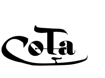
- Whoops, I forgot this one....


28 comments:
I like the second one... looks like tits. Or balls and u know what!
Israel, either you have a very dirty mind or I'm really dense. I don't see it.
And for all you logo people, if we want to be successful, we need to have three letters for our initials -- something like CTC (for Common Table Church) or CTI ( Common Table, Inc.) When we were doing the logo stuff for my company, we were told that successful organizations always have three letters (think IBM, ATT, even ARC for American Red Cross.) I'm telling you, you gotta have three letters.
Liz
Umm, Israel, have you been drinking?
Well then so do I, liz. Franks and beans! Franks and beans!
Sorry Schuyler, but no. 3 ... [dissolves into laughter]....
Okay, I've composed myself now. But to quote a joke:a psychologist shows a patient a series of Rorschach blots in which the patient sees progressively lewder and lewder sex acts, when the psychologist tells the patient he thinks he is a diagnosable sexual deviant, the patient replies, "hey *I'm *not the one drawing all the dirty pictures." (Cause the cup in the second logo from your last post looked like an impossibly perky boob to me. I think another 40-60 degrees of the arc of the rim of the cup would remove the illusion, although it sadly will not help my mind. Or apparently Israel's for that matter.)
Seriously, I liked the previous two logos you did, although I think you'd need to draw more of the circle of the cup on the second logo. I also stylistically liked one and two above, but would still like to have both words in the logo. 4 and 5 looked more "corporate" to me, though. And you may as well know my dirty little secret now, which is that I have a fetish for serif fonts. Arial must die. If you make a serif font I will promise not to notice the next dirty picture/logo you post. :)
Serif fonts blow. It's just cluttering up the nice smooth lines of the letters. And wow, did this conversation get out of control.
Two other notes: the corporateness was meant as a sort of subversive anti-corporate thing.
Second, none of these are particularly serious. I'm not, nor have I ever been, a graphic designer. I just wanted to move the conversation to something more fun.
Which you seem to have accomplished!!!
I think another question has to be answered ... are we:
a. Common Table Church ... or
b. Church of the Common Table
Does anyone know?
I personally like Common Table Church. I think that it flows better. Church of the Common Table kind of sounds like we have an actual physical Common Table for which the church is named.
well, I AM a graphic designer. And I have this cutting edge new style called "I don't care!"
but seriously, I didn't see franks and beans and tits until Ryan mentioned it... now I see them all over (come ON... look at #3 & #4...
I would prefer common table community because "church" has been so hijacked by the fundamentalist community.
I would prefer common table community because "church" has been so hijacked by the fundamentalist community.
or should I say "fundamentalist psudo-community"
how about about common table emerging
JK!!!!
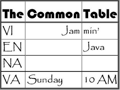
I thought there was a the in the name. ie The Common Table. with nothing after it. is that not allowed?
I thought it was The Common Table too.
yea, that was my first thought too... and if we use that name we can also align with the book "The Common Table" ("Recommended for anyone interested in finding a higher power outside a church setting" according to Amazon -- http://www.amazon.com/gp/product/0887307019/002-9567693-9092828?v=glance&n=283155)
Wait, Israel -- please don't tell me we're not a church. You can call us whatever we want, believe or not believe whatever you want, but let's at least continue to be a church... I was beginning to think it was the one thing we could all agree on. Are you now leaving me with nothing?!!
OK, OK... Ryan and Israel... you bad boys, you. You've corrupted sweet inocent me. Now I see #3. I'm still having trouble with #4.
OK, OK... Ryan and Israel... you bad boys, you. You've corrupted sweet inocent me. Now I see #3. I'm still having trouble with #4.
I think the proposed name is "The Common Table". That's all; no other words. And I like it like that, lots more than "Common Table Church", "Common Table Community" or "Church of the Common Table". We are a church, but that doesn't mean we need the word "church" in our name. I work for a company that does not have the word "company" in its name, and it's none the poorer for it.
Just my $0.02. Cool logos!
Serif fonts blow???
Them's fightin' words, Jeb...
You know ... it depends on what you're using the font for. Sometimes you want some cool serifs and other times they get in the way. You really can't make a declarative statement one way or the other about them. Trust me on this ... I do graphics and write newsletters and use fonts for all kinds of things. There's really good use for both. Uhhhh ... that's why we have both.
So get back into your corners boys ...
More heresy! Arial. Must. Die!
Those who have ears to hear...
I like the second one... looks like tits. Or balls and u know what!
Kate, I'd be ok with being called a church if that's the most helpful to most people. And I do think we want to be a part of Jesus body and well, I could get all technical about this term "church" but it's really only as important as people care to make it... and well, most people don't care about what "church" really is or whether it shoudl be called "meeting house" instead (as the Quakers more accurately call church meeting sites). But, I don't want to take anything from you... we are what we are no matter what our name or title.
Wow. I had no idea what I was missing last week.
Post a Comment